Brand Identity & Logo Design
–
R/GA, 2020—2022
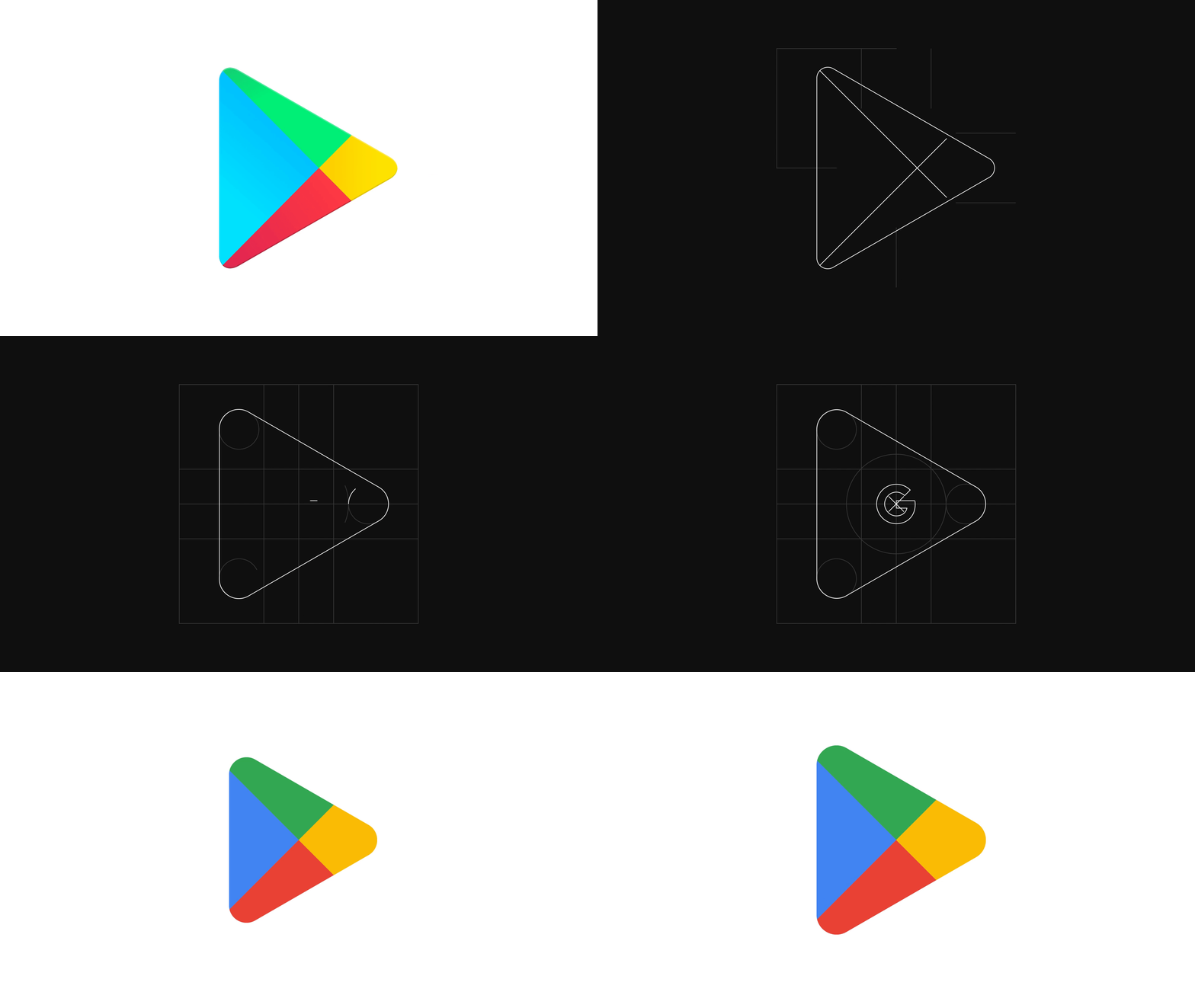
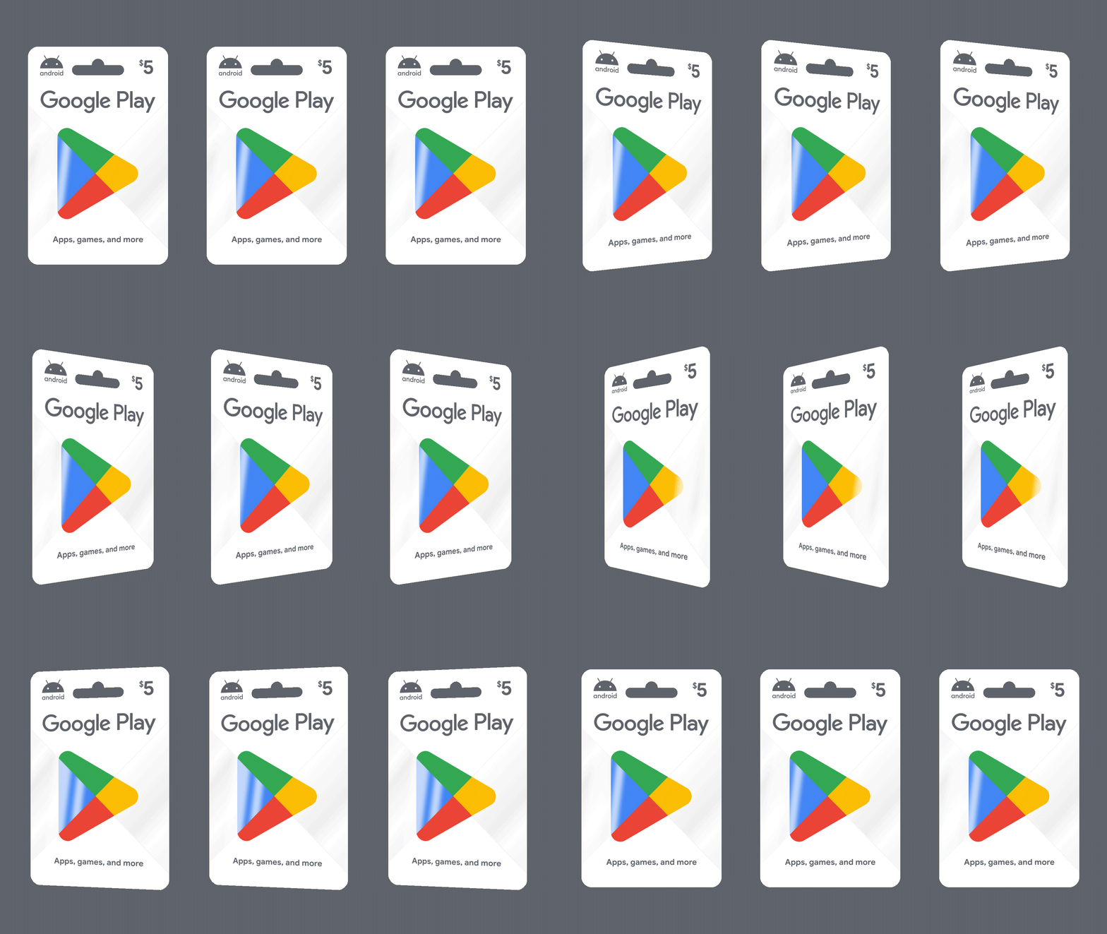
The core of the brand evolution started with Play's own equity. We saw untapped potential in the legacy of Google Play's logo, commonly referred to as "the Prism." We honed in on the idea that prisms are active and multidimensional––just like discovery. Revealing an opportunity to build a brand that unlocked an entire spectrum of Play.
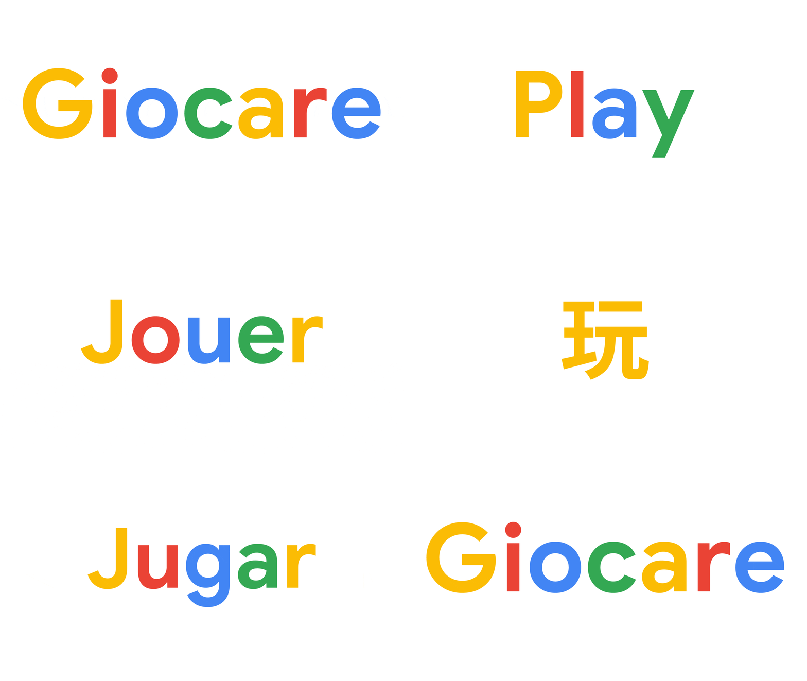
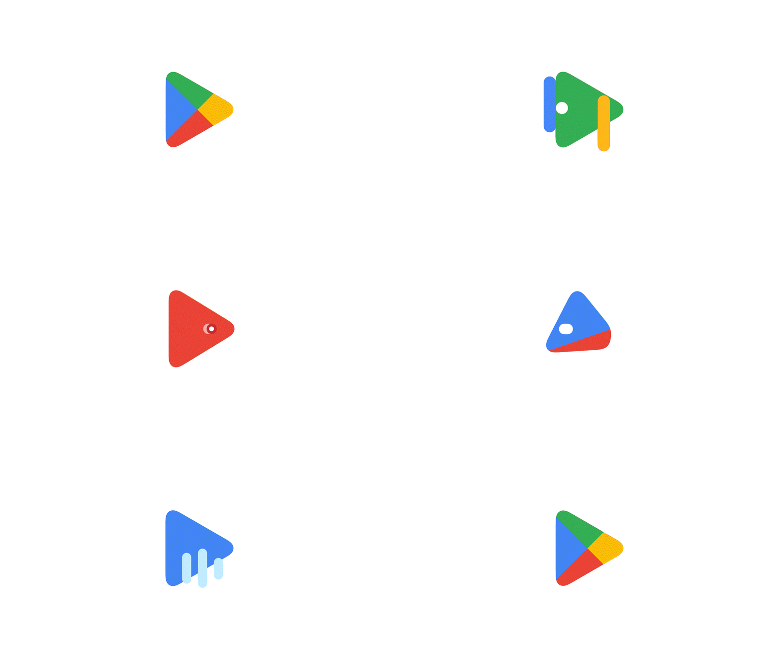
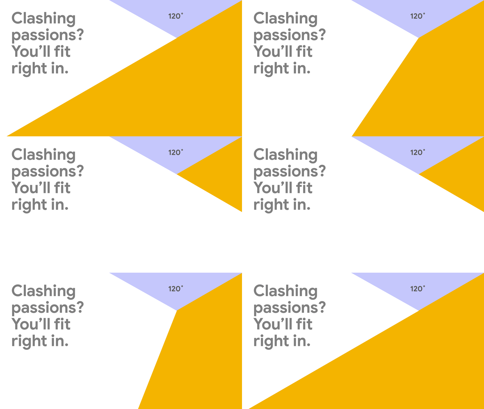
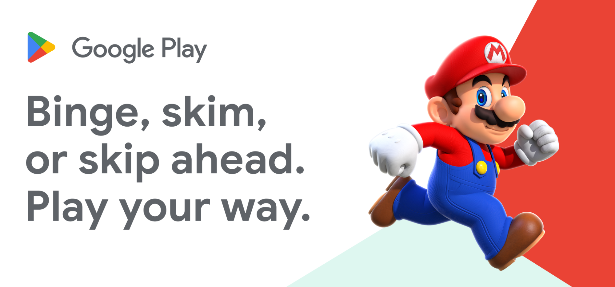
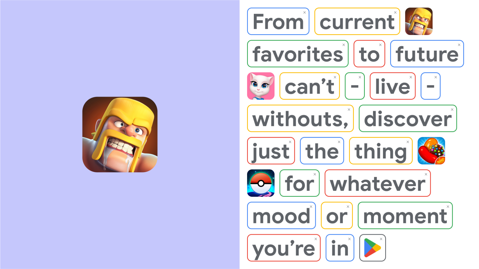
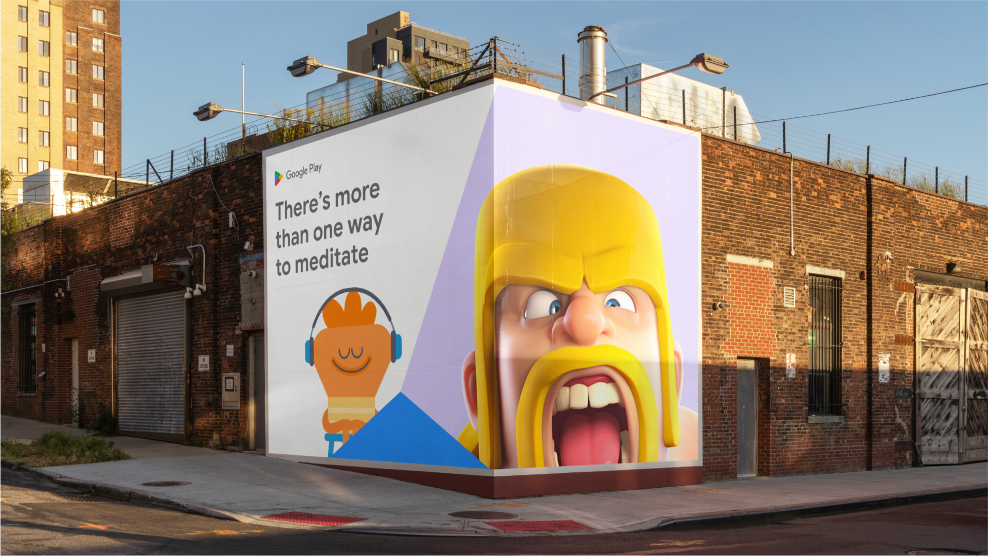
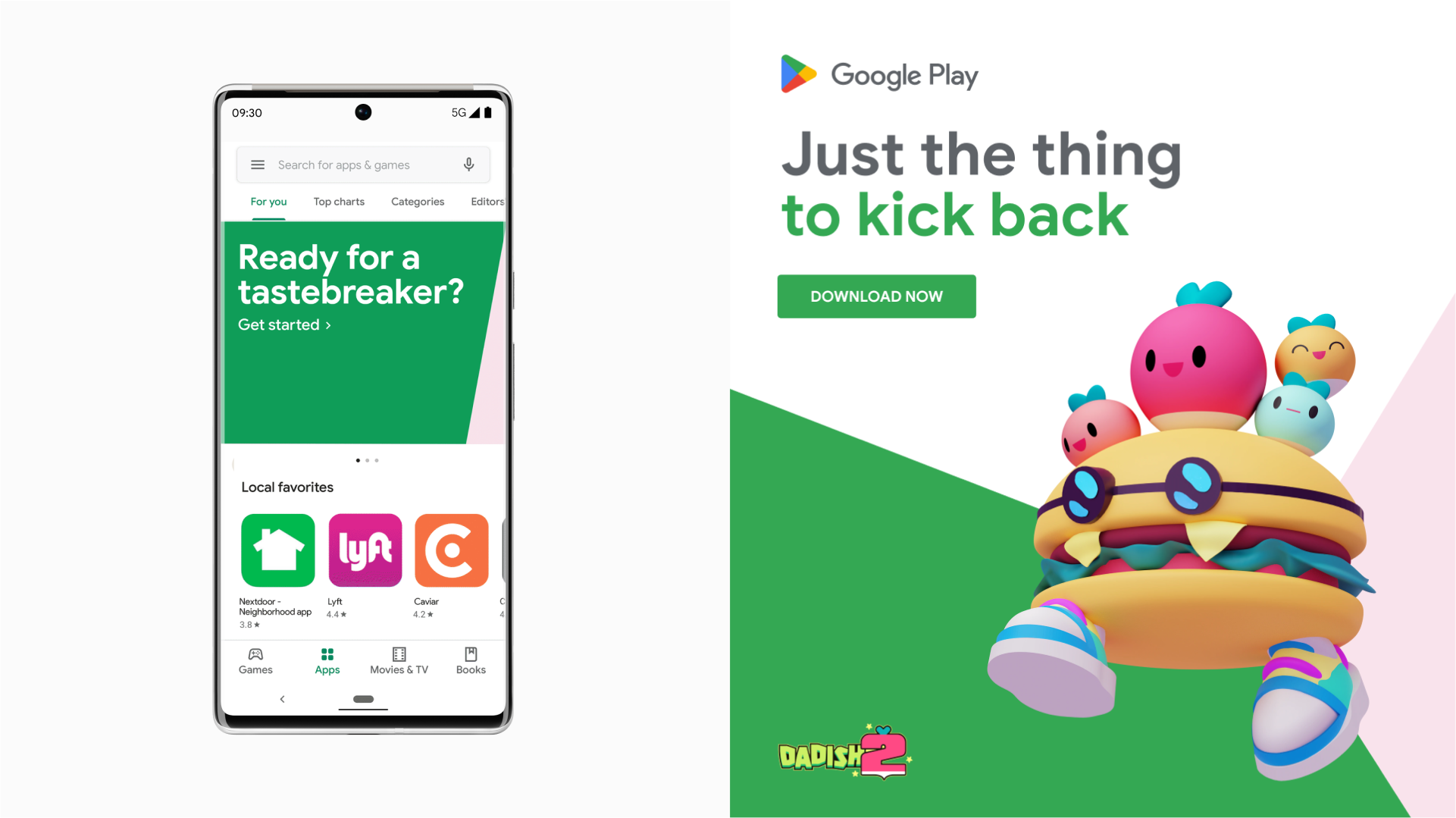
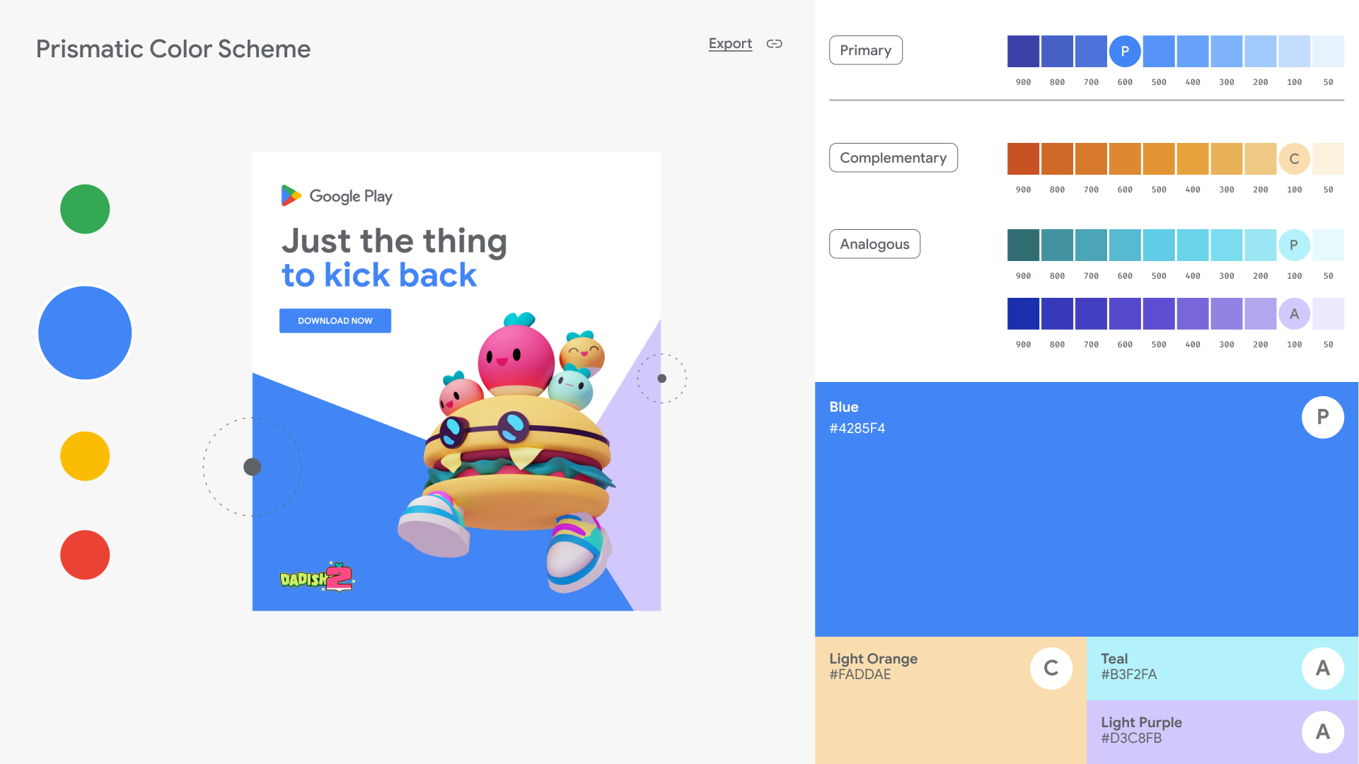
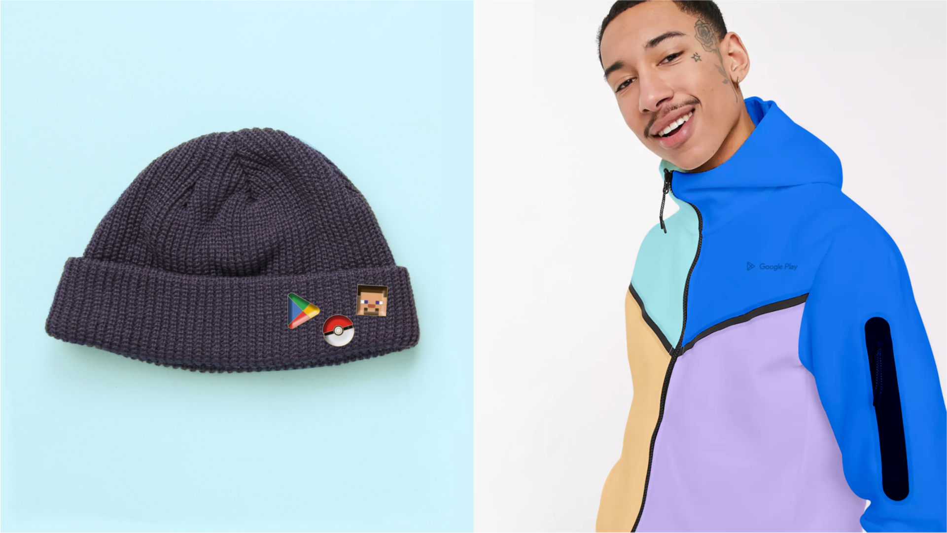
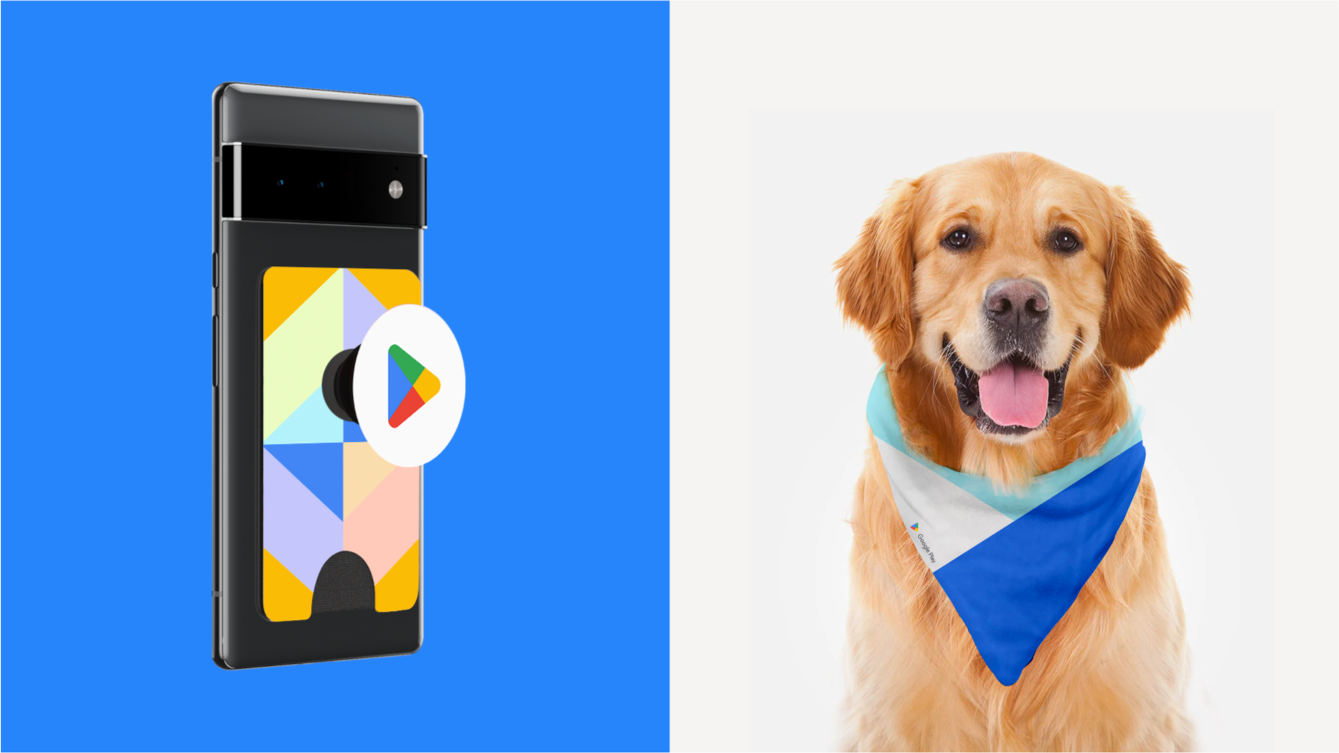
The redesign shifts the prism from a static logo into a prismatic behavior—always seeking to reveal new sides of what you love and expand your world. To deliver a single cohesive visual, verbal, and behavioral identity system. The team developed a unique brand voice that inspired discovery and celebrated people's contradictory interests that make Play so rewarding; a new prismatic visual design system that was reflective of every side of Play; and behavior that prioritized user-first interaction across all of Play's marketing materials.
Creative Direction: Augustus Cook
Design Direction: Bethany Kennedy, Augustus Cook
Visual Design: Junsun Ko, Elaine Li, Kinzie Burke
Verbal Design: Jennifer Vano, Aljelica Claxton, Rachel Cantrell, Dilian Diatlo
Production: Rafael Rodrigues, Carmen Cramer, Corey Lewis, Matt VanDzura, John Erekson, Chaya Leverton, Christina Hemsworth
Animation: Ryan Walker, Junsun Ko
